Preliminary Task Evaluation
I used Prezzie to make a slideshow of what I did making my school magazine using Photoshop. I did this because it looks professional and it is important to relate back in-case i need to go back and review what I did using Photoshop. Also by looking at the presentation other people will be able to make their own magazine cover using my tips and ideas and then the presentation will show them how to do this. I think my magazine is good because it has most of the codes and conventions needed for a professional magazine, with a strong house colour and good sell lines. My magazine is structured well because it is clear and gives all the relevant information.
.
Main Task Evaluation
1.
In what ways does
your media product use, develop or challenge forms and conventions of real
magazine products?
My media magazine uses recognised forms, codes and
conventions of real magazines by utilising expected conventions that real
magazines use. By looking at real music magazines, I was able to see what was effective,
what layout suited me best and what style I could develop. I could then amalgamate this research and demonstrate
this in my magazine. I applied what the
top magazines use like social media links such as Twitter and Facebook, a house
colour, bold structured fonts and other conventions such as pugs, imperative
verbs, a masthead, coverlines, barcode etc. to show the examiner that I have
the skills to produce a realistic magazine and a professional one. By doing
this, my magazine can compete with ‘real’ magazines as they have recognisable
features and forms.
2.


4.
Who would be the
audience for your media product?
Males and Females aged 15-30 would be my target
audience, they are young and free to be individual just like my magazine. 


5.
6.
The slideshare above shows how i have documented my progression from my prelimiary task to my main task. the following screenshots will illustrate the deign process that i went through when creating my finalised media product. I have clearly shown my ability using advanced media technology such as Photoshop and Page plus.

To start my magazine I started in Photoshop and used my old mock up contents as a guide. I wanted to keep the house style evident and simple as I believe it makes it look more professional and they are the key colours which are associated with the band that I am writing about (the 1975).


I used my model on a black
backdrop, I found this easier to edit and crop it also fitted better with my magazine
as my magazine had a black background.


I then used white font and lines
to fraction the page and to allow the audience to clearly read the page and see
everything on it without it looking over crowded or too busy. By using
contrasting colours it allows me to do this.


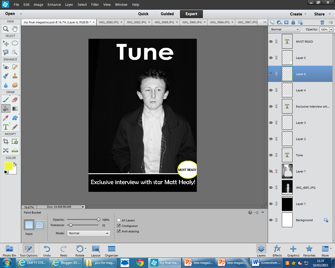
By using a pug with a yellow ring
around it, adds to the house style and highlights the more important parts on
the page. This is used to attract the reader’s attention to a particular part
of the page. Also by using a pug it emphasises how important the story is
alluring the reader in.


Using the lasso tool, I could
then crop the image to resize it which allowed me to change the background and
see what would look better and more professional.


I changed the brick wall as I wanted to keep it simplistic and I thought that the plain background looked better than the brick one.
By changing the size and colour
of more important font it draws the reader’s attention to these parts, this
attracts other readers and other target audiences to look at my magazine ensuring
that my magazine tune sells and appeals to more people than other magazines.

By adding social platforms to the
bottom of my magazine cover it makes it more of a conglomerate and makes it
more professional, allowing the audience to reach the institution in a variety
of ways.


I had to lasso and crop the imported social media networks, this made them look less ‘bubbly’ and more professional, allowing it to fit better with my front cover. I didn’t make these black and white because I don’t want to alter the logo and breach copyright, I also want readers to know that my magazine has a Twitter and Facebook account and by not changing the colours it clearly stands out resulting in new followers and friends from fans of the magazine.
Once I finished my front cover and I was happy it fulfilled all of the codes and conventions that it needed to then I started my contents page.


I used Page Plus showing my skills in a variety of
programmes to produce my contents page for Tune. Here, looking at the title and
the main story, it is evident of a house style that is black white and
yellow.


By using black and white images,
again it reinforces the house style and the artistic style of my magazine
whilst giving the reader an insight as to what to expect from my magazine.


For my double page spread I used a black backdrop, this compliments the main image of the story as well as the smaller arty images.

Here, I can see that my far right model is clashing with the middle of the double page spread. This alters the image as when folded in half you would not be able to see his face. Below is evidence that I used photo shop to change this in order to get the best results and so that he doesn't crease in the middle.

As well as altering the image by cutting it using the lasso tool and pasting the white background in between the models to give him space from the middle, I also added the title and page number to the bottom of the page. By doing this it keeps my magazine identity and informs the reader of what page they're on.

To tie it up, I added yellow font across the main image. This introduced the band and the words 'speak up' indicate what they are about to do on the following text. This interests the audience as it keeps it fun and informative. I added an editors message in this part so that the audience can see how personal the magazine is, this way they have a type of personal bond with the editor.

To finalise my magazine double page spread, I added a drop cap, by lines and captions to the images. By doing this it gives little details about me and my magazine that are important. Furthermore, it also adheres to the generic codes and conventions that I researched in preparation for my double page spread.
7.

Throughout your evaluation you have made it clear how you can confidently use a variety of media technology. You have answered all of the questions very well and have linked your answers back to your preliminary task and how you have developed your skills.
ReplyDelete